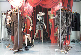

Dover Street Market is a multilevel fashion retail store created by Rei Kawakubo of Japanese fashion label Comme des Garcons, located in Mayfair.
As soon as I walked into this store it gave me impressions of the war and underground workers, making me feel like I'd walked into a museum rather than a shop. The staff were friendly but not pushy and a relaxing vibe was present on this entry floor, though each floor was different.
BASEMENT FLOOR:-
This floor used loud modern music to match its slight urban style, and to me felt genuinely like a basement floor where the young kids chill. The colour palette was dominant of grey and white but it was still brightly lit, a port-a-loo used as part of the decor. It was mainly mens clothing, and the skateboard designs on the wall added to the graphic prints of the t-shirts, the caps and the shoes. Shoes were displayed on top of white boxes, almost randomly, at different levels, allowing you to view each pair easily. Brick walls were on show, giving it an unfinished look. I felt in a comfortable atmosphere as it seemed impersonal, enjoying the music as I took in the surroundings and the fashion.
GROUND FLOOR:-
Here had more of a construction look, with a lot of wood on show and a mixture of wide and narrow spaces, a port-a-loo too positioned amongst the clothings, adding to its scene. The clothes were displayed neatly and carefully, contrasting to their surroundings I felt, but so tidily I felt I could only look at them as I walked around. It wasn't entirely clear where to go to find other floors, feeling almost like a maze as the lifts and stairwells were designed so entirely different. This floor though, had a warm atmosphere, staff weren't pushy and it was all cleverly set out, with a wooden and metal shack in the middle and the brick walls still on show.
FIRST FLOOR:-
This floor showed a change in setting, concrete floor was still present but there were no more visible brick walls. The dominant colours were red and black in one area and then grey and white again the other side. There was a smarter feel to this floor, and noticeably the staff were less welcoming. A wooden and metal shack was again present though, reminding you of the stores main scene. Clothing was again displayed perfectly with lots of space and mannequins were also present, spaced out also, allowing you to enjoy the clothing even more. Fancy, vintage stlye cabinets held bags, along with intricately detailed pillars. It was also a lot quieter, only music coming from a radio in a corner, giving the floor an intimidating feel.
SECOND FLOOR:-
Again, a complete change of atmosphere when entering this floor. The wood involved was glossy and used in a neater manner, with cabinets and tables. Menswear took up the centre of the floor, and just like every other floor, the clothes were hung perfectly and the shoes displayed below the clothing in an effective way. Concrete floor was still used, but this floor had a homely feel to it I felt. The womens section went into a corner and here the colour was grey and silver. The World Archive section was presented completely different to the rest of the floor as it showed indian styled prints and feathers, the colouring here much brighter, turning itself into its own shop.
THIRD FLOOR:-
This floor had a theatrical vibe to it, with rich red curtains and gold roping, theatrical masks and mannequins mid movement, surrounded by rails of clothing and shoes, giving me the impression of backstage at a catwalk show. Next to this though was positioned two antique looking pianos, with shoes and bags in cabinets, perhaps adding to the theatrical idea of music. The flooring was no longer concrete and carpet was involved, giving the floor a classier look, shoes displayed artistically also on zig zagging shaped blocks. An electricity cable, with cactus and sand below seemed strangely out of place, holding only a few items of clothing, but at the same time added more to the art. A cleverly presented floor.
FOURTH FLOOR:-
The top and final floor had a mixture of clothing and food, as a quaint little bakery was present. There was a lot of attention to detail here, decorative with old brands of food displayed giving the image of a time during the war: a false bakery next to the modern day one of the store. It gave a friendly atmosphere as it was louder and full of chatter from the customers along with its welcoming staff. A lot of wood was used again, and the colours grey and white just like the other floors, but without concrete flooring, this time tiled like its floor below. It felt like a smaller space and that the clothing had been a side thought, though at the same time you could see how it was all carefully arranged. A refreshing floor after the grand tour up there.
No comments:
Post a Comment